
Navigation Drawer is one of the most important visual components defined by Material Design. Maybe its name doesn’t tell you anything, but you know it well as a user. It’s the popular side menu that slides from the left (or the right in the case of right-to-left languages) and usually has a hamburger button to display it.
>>  Read this post in Spanish here <<
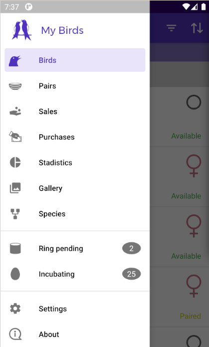
The following screenshot shows the menu of one of my free apps.
Sooner or later, you’ll have to include this kind of menu in your apps. In this tutorial, I explain you how to use the implementation that Google provides with the AndroidX and Material Components libraries. We’ll explore the basics and the integration with AndroidX Navigation framework.
Note. Over the years, side menus have lost popularity against the Bottom Navigation menu. Google recommends the latter for menus with five or fewer navigation items.
Contents
- Project with Navigation Drawer
- Menu items
- Header
- Menu actions
- Integration with AndroidX Navigation framework
- Styles
- Conclusion
- Source code
Project with Navigation Drawer
Let’s start by creating a sample project with the latest libraries and tools available in June 2023:
- Android API 33
- Gradle 8.0 (requires Java 11)
- Android Studio Flamingo
- Material Components 1.9
The programming language is Java. Still, the code will be so simple that you won´t have any problem adapting it to Kotlin if you prefer this language.
Warning. You may come across tutorials and books that use Support Libraries to build the sidebar menu. No case. They are prehistoric materials in technological terms. Google abandoned the development of those libraries at the end of 2018 and integrated them into AndroidX.
Dependencies
Add the dependency for Material Components to the build.gradle file:
apply plugin: 'com.android.application'

android {
    compileSdkVersion 33

    defaultConfig {
        applicationId "com.danielme.android.navigationdrawer"
        minSdkVersion 26
        targetSdkVersion 33
        versionCode 1
        versionName "1.0"
    }
    buildTypes {
        release {
            minifyEnabled true
            proguardFiles getDefaultProguardFile('proguard-android.txt'), 'proguard-rules.pro'
        }
    }
    namespace 'com.danielme.android.navigationdrawer'
}

dependencies {
    implementation fileTree(dir: 'libs', include: ['*.jar'])
    implementation 'com.google.android.material:material:1.9.0'
}
DrawerLayout and NavigationView
The sample app has a single activity named HomeActivity. The root of its layout is the DrawerLayout widget. It’s a ViewGroup provided by AndroidX that contains the components related to the sidebar menu. Place inside two components:
- The app bar \ action bar implemented by the
MaterialToolbarcomponent. Put it within aLinearLayoutin which we’ll later insert a fragment. - The component
NavigationView(the sidebar menu).
This is the file /res/layout/activity_home.xml with the first version of the layout:
<androidx.drawerlayout.widget.DrawerLayout xmlns:android="http://schemas.android.com/apk/res/android"
    xmlns:tools="http://schemas.android.com/tools"
    android:id="@+id/drawer_layout"
    android:layout_width="match_parent"
    android:layout_height="match_parent"
    android:fitsSystemWindows="true"
    tools:openDrawer="start">

    <LinearLayout
        android:id="@+id/home_content"
        android:layout_width="match_parent"
        android:layout_height="match_parent"
        android:orientation="vertical">

        <com.google.android.material.appbar.MaterialToolbar
            android:id="@+id/toolbar"
            android:layout_width="match_parent"
            android:layout_height="?attr/actionBarSize" />

    </LinearLayout>

    <com.google.android.material.navigation.NavigationView
        android:id="@+id/navigation_view"
        android:layout_width="wrap_content"
        android:layout_height="match_parent"
        android:layout_gravity="start"
        android:fitsSystemWindows="true" />

</androidx.drawerlayout.widget.DrawerLayout>
Activity
In HomeActivity, besides the Toolbar, you must configure the DrawerLayout with the ActionBarDrawerToggle class. Its name gives a hint of its mission: integrating the drawer menu with the ToolbarActionBar so that its tapping slides the menu to make it visible. If you don’t configure this behavior, the menu can only be opened by swiping the left side of the screen to the right.
This (boilerplate) code materializes the previous paragraph:
public class HomeActivity extends AppCompatActivity {

  private DrawerLayout drawerLayout;

  @Override
  protected void onCreate(Bundle savedInstanceState) {
    super.onCreate(savedInstanceState);
    setContentView(R.layout.activity_home);

    Toolbar toolbar = findViewById(R.id.toolbar);
    setSupportActionBar(findViewById(R.id.toolbar));

    drawerLayout = findViewById(R.id.drawer_layout);
    ActionBarDrawerToggle toggle = new ActionBarDrawerToggle(
           this, drawerLayout, toolbar, R.string.navigation_drawer_open, R.string.navigation_drawer_close);
    drawerLayout.addDrawerListener(toggle);
    toggle.syncState();
}

Typically, another desirable behavior is the closing of the menu with the tap of the Android Back button:
@Override
 public void onBackPressed() {
   if (drawerLayout.isDrawerOpen(GravityCompat.START)) {
     drawerLayout.closeDrawer(GravityCompat.START);
   } else {
     super.onBackPressed();
   }
 }
You listen to the event by overriding the onBackPressed method inherited by the activity. The code is simple once you know two DrawerLayout methods: the one that informs if the menu is open (isDrawerOpen) and the one that closes it (closeDrawer). When the menu is closed, call super.onBackPressed(). Thus the back action will perform the default behavior—navigate one level backward in the screen history. Since our sample app only has one screen, pressing Back with the menu closed closes the app.
Styles
Let’s take care of the styles. In the file /res/values/themes.xml, I have declared as the global theme of the app one of type DayNight from Material Components. These themes are the ones that support light and dark themes at the same time. In poarticular, I’ve chosen the one that doesn’t apply to the system ActionBar, as we have our own MaterialToolbar and we’ll give it a custom style. Of course, you’re free to choose or create the theme you want.
<?xml version="1.0" encoding="utf-8"?>

<resources xmlns:tools="http://schemas.android.com/tools">

    <style name="AppTheme" parent="Theme.MaterialComponents.DayNight.NoActionBar">
        <item name="colorPrimary">@color/primary</item>
        <item name="colorPrimaryDark">@color/primaryDark</item>
        <item name="toolbarStyle">@style/Widget.MaterialComponents.Toolbar.PrimarySurface</item>
        <item name="drawerArrowStyle">@style/AppTheme.DrawerArrowStyle</item>
    </style>

    <style name="AppTheme.DrawerArrowStyle" parent="Widget.AppCompat.DrawerArrowToggle">
        <item name="color">@android:color/white</item>
    </style>

</resources>
Note the drawerArrowStyle property: it sets the style for the hamburger icon. It will be white.
With the above styles, the Android status bar covers the menu. It looks weird.

Although the typical design depicts the menu covered by the status bar, it does so by applying a translucent effect. Achieving this is trivial:
<style name="AppTheme" parent="Theme.MaterialComponents.DayNight.NoActionBar">
     <item name="colorPrimary">@color/primary</item>
     <item name="colorPrimaryDark">@color/primaryDark</item>
     <item name="android:statusBarColor">@android:color/transparent</item>
     <item name="toolbarStyle">@style/Widget.MaterialComponents.Toolbar.PrimarySurface</item>
     <item name="drawerArrowStyle">@style/AppTheme.DrawerArrowStyle</item>
 </style>

Congratulations! You built your first navigation drawer menu. For now, it’s a blank canvas on which you’ll draw the navigation items.
Menu items
Let’s give some content to the menu. You define the content like any Android menu: in an XML, located in the /res/menu folder, with items of type <item> corresponding to each menu entry.
This is the menu for the example project (activity_home_navigation_drawer.xml). It defines five items with text and an icon:
<?xml version="1.0" encoding="utf-8"?>

<menu xmlns:android="http://schemas.android.com/apk/res/android"
    xmlns:tools="http://schemas.android.com/tools"
    tools:showIn="navigation_view">

    <group android:checkableBehavior="single">

        <item
            android:id="@+id/nav_camera"
            android:icon="@drawable/ic_menu_camera"
            android:title="@string/menu_camera" />

        <item
            android:id="@+id/nav_gallery"
            android:icon="@drawable/ic_menu_gallery"
            android:title="@string/menu_gallery" />

        <item
            android:id="@+id/nav_tools"
            android:icon="@drawable/ic_menu_manage"
            android:title="@string/menu_tools" />

        <item
            android:id="@+id/nav_share"
            android:icon="@drawable/ic_menu_share"
            android:title="@string/menu_share" />

        <item
            android:id="@+id/nav_send"
            android:icon="@drawable/ic_menu_send"
            android:title="@string/menu_send" />

    </group>

</menu>
Choose descriptive but concise titles—Android will truncate the title if it doesn’t fit on the screen. And although icons are optional, they make the menu easier to use.
Now bind the menu and the NavigationView component:
<com.google.android.material.navigation.NavigationView
      android:id="@+id/navigation_view"
      android:layout_width="wrap_content"
      android:layout_height="match_parent"
      android:layout_gravity="start"
      android:fitsSystemWindows="true"
      app:menu="@menu/activity_home_navigation_drawer" />
Voilá! Heres the menu.

You can organize the items in sections, with or without titles, divided by a small separator. The point is to group related menu items so the user can quickly find the entry he needs, which is recommended when the menu is large.
A section is a block <group> with the items it contains. If the section needs a title, put its group within a <menu> block, which, in turn, you place within an <item> element in which you define the title.
Does it sound complicated? To make it clear, I’ll organize the example menu in three sections, the last one with a title:
<?xml version="1.0" encoding="utf-8"?>
<menu xmlns:android="http://schemas.android.com/apk/res/android"
    xmlns:tools="http://schemas.android.com/tools"
    tools:showIn="navigation_view">

    <group android:checkableBehavior="single">
        <item
            android:id="@+id/nav_camera"
            android:icon="@drawable/ic_menu_camera"
            android:title="@string/menu_camera" />
        <item
            android:id="@+id/nav_gallery"
            android:icon="@drawable/ic_menu_gallery"
            android:title="@string/menu_gallery" />
    </group>

    <group
        android:id="@+id/group1"
        android:checkableBehavior="single">
        <item
            android:id="@+id/nav_tools"
            android:icon="@drawable/ic_menu_manage"
            android:title="@string/menu_tools" />
    </group>

    <item android:title="@string/menu_group">
        <menu>
            <group android:checkableBehavior="single">
                <item
                    android:id="@+id/nav_share"
                    android:icon="@drawable/ic_menu_share"
                    android:title="@string/menu_share" />

                <item
                    android:id="@+id/nav_send"
                    android:icon="@drawable/ic_menu_send"
                    android:title="@string/menu_send" />
            </group>
        </menu>
    </item>

</menu>
In the following picture, you have the menu structure as shown in the visual editor of Android Studio.

The result.

Header
Usually, side menus have a header that displays information about the app and the user. You can use any layout, so the header can contain pretty much whatever you want. The NavigationView component displays it at the top of the menu.
For example, let’s use as a header the following layout (/res/layout/nav_header.xml). It’s a ConstraintLayout that piles two TextViews, one with the icon and name of the app and another with a copyright text:
<?xml version="1.0" encoding="utf-8"?>

<androidx.constraintlayout.widget.ConstraintLayout
    xmlns:android="http://schemas.android.com/apk/res/android"
    xmlns:app="http://schemas.android.com/apk/res-auto"
    android:layout_width="match_parent"
    android:layout_height="wrap_content"
    android:fitsSystemWindows="true"
    android:background="@android:color/holo_blue_dark">

    <TextView
        android:id="@+id/header_title"
        android:layout_width="match_parent"
        android:layout_height="wrap_content"
        android:layout_marginStart="@dimen/activity_horizontal_margin"
        android:layout_marginTop="@dimen/activity_horizontal_margin"
        android:drawablePadding="12dp"
        android:gravity="center_vertical"
        android:text="@string/app_name"
        android:textAppearance="@style/Base.TextAppearance.AppCompat.Medium.Inverse"
        app:drawableStartCompat="@mipmap/ic_launcher"
        app:layout_constraintTop_toTopOf="parent" />

    <TextView
        android:layout_width="0dp"
        android:layout_height="match_parent"
        android:paddingTop="@dimen/activity_vertical_margin"
        android:paddingBottom="@dimen/activity_vertical_margin"
        android:text="@string/copyright"
        android:textAppearance="@style/Base.TextAppearance.AppCompat.Small.Inverse"
        app:layout_constraintEnd_toEndOf="@+id/header_title"
        app:layout_constraintStart_toStartOf="@+id/header_title"
        app:layout_constraintTop_toBottomOf="@+id/header_title" />


</androidx.constraintlayout.widget.ConstraintLayout>
ConstraintLayout requires this dependency:
implementation 'androidx.constraintlayout:constraintlayout:2.1.4'
Next, set the header in the headerLayout property of NavigationMenu:
<com.google.android.material.navigation.NavigationView
        android:id="@+id/navigation_view"
        android:layout_width="wrap_content"
        android:layout_height="match_parent"
        android:layout_gravity="start"
        android:fitsSystemWindows="true"
        app:headerLayout="@layout/nav_header"
        app:menu="@menu/activity_home_navigation_drawer" />
This is how the header looks like.

Notice that in ConstraintLayout I activated fitsSystemWindows to add some padding to the layout that separates it from the status bar. Without that setting, you’ll see an ugly effect, as shown below.

The header can be interactive and its contents dynamic since the header is accessible with the NavigationView#getHeaderView method. For example, these lines of code display a Toast when the user taps the TextView with the title:
 View header = navigationView.getHeaderView(0);
 header.findViewById(R.id.header_title).setOnClickListener(view -> Toast.makeText(
            HomeActivity.this,
            getString(R.string.title_click),
            Toast.LENGTH_SHORT).show());
Menu actions
The menu is useless—nothing happens if you tap one of its entries.
You need to implement a listener of type NavigationView.OnNavigationItemSelectedListener to handle the clicked items. Its only method takes as an argument the item that was touched:
public interface OnNavigationItemSelectedListener {

    public boolean onNavigationItemSelected(@NonNull MenuItem item);

}
Let’s display a fragment (HomeContentFragment), with the name of the tapped item, adding it to the LinearLayout that contains the Toolbar. In other words, we stay in HomeActivity and change the content of the screen, as well as the title of the Toolbar.
The fragment layout:
<?xml version="1.0" encoding="utf-8"?>
<LinearLayout xmlns:android="http://schemas.android.com/apk/res/android"
    android:layout_width="match_parent"
    android:layout_height="match_parent"
    android:background="@android:color/darker_gray"
    android:gravity="center"
    android:orientation="vertical">

    <TextView
        android:id="@+id/text"
        style="@android:style/TextAppearance.Large"
        android:layout_width="wrap_content"
        android:layout_height="wrap_content"
        android:textStyle="bold" />

</LinearLayout>
The class:
package com.danielme.android.navigationdrawer;

import android.os.Bundle;
import android.view.LayoutInflater;
import android.view.View;
import android.view.ViewGroup;
import android.widget.TextView;

import androidx.annotation.Nullable;
import androidx.annotation.StringRes;
import androidx.fragment.app.Fragment;

public class HomeContentFragment extends Fragment {

  private static final String TEXT_ID = "text_id";

  public static HomeContentFragment newInstance(@StringRes int textId) {
    HomeContentFragment frag = new HomeContentFragment();

    Bundle args = new Bundle();
    args.putInt(TEXT_ID, textId);
    frag.setArguments(args);

    return frag;
  }

  @Override
  public View onCreateView(LayoutInflater inflater, @Nullable ViewGroup container, @Nullable
  Bundle savedInstanceState) {
    View layout = inflater.inflate(R.layout.home_fragment, container, false);

    if (getArguments() != null) {
      String text = getString(getArguments().getInt(TEXT_ID));
      ((TextView) layout.findViewById(R.id.text)).setText(text);
    } else {
      throw new IllegalArgumentException("Argument " + TEXT_ID + " is mandatory");
    }

    return layout;
  }
}
HomeContentFragment follows the recommended static constructor (*) technique (newInstance method) to encapsulate the creation of its objects and the transfer of the incoming arguments. Remember that fragments must be created with their no-arg constructor.
(*) Check out the first chapter of the awesome book Effective Java 3rd edition.
The onCreateView method retrieves the text to be displayed and sets it in the TextView.
Let’s focus on the most interesting part: implementing OnNavigationItemSelectedListener. For convenience, I have written the listener inside HomeActivity:
public class HomeActivity extends AppCompatActivity
        implements NavigationView.OnNavigationItemSelectedListener {

 @Override
  public boolean onNavigationItemSelected(@NonNull MenuItem menuItem) {
    int titleId = getTitle(menuItem);
    showFragment(titleId);
    drawerLayout.closeDrawer(GravityCompat.START);
    return true;
  }

  private int getTitle(@NonNull MenuItem menuItem) {
    switch (menuItem.getItemId()) {
      case R.id.nav_camera:
        return R.string.menu_camera;
      case R.id.nav_gallery:
        return R.string.menu_gallery;
      case R.id.nav_tools:
        return R.string.menu_tools;
      case R.id.nav_share:
        return R.string.menu_share;
      case R.id.nav_send:
        return R.string.menu_send;
      default:
        throw new IllegalArgumentException("menu option not implemented!!");
    }

  private void showFragment(@StringRes int titleId) {
    Fragment fragment = HomeContentFragment.newInstance(titleId);
    getSupportFragmentManager()
            .beginTransaction()
            .setCustomAnimations(R.anim.nav_enter, R.anim.nav_exit)
            .replace(R.id.home_content, fragment)
            .commit();

    setTitle(getString(titleId));
  }

}
Although it appears a lot of code, there’s nothing special or tricky about it. getTitle contains the typical switch that evaluates the options of a menu. In our case, it chooses the text that HomeContentFragment shows. With that text, the showFragment method instances the fragment, adds it to home_content, and changes the title of the activity’s Toolbar.
You must also add the listener to the NavigationView component in onCreate:
NavigationView navigationView = findViewById(R.id.navigation_view);
navigationView.setNavigationItemSelectedListener(this);
One last detail: selecting the initial screen. At startup, HomeActivity should display the first menu item (or the one you want). In the example it´s the fragment for the camera option. Just simulate the activation of the desired menu item with this code located in the onCreate method:
MenuItem menuItem = navigationView.getMenu().getItem(0);
onNavigationItemSelected(menuItem);
menuItem.setChecked(true);
Now you have it—a real navigation menu.

In addition to selecting an item, you can receive other events triggered by the menu by implementing a listener of type DrawerLayout.DrawerListener:
public class HomeActivity extends AppCompatActivity
        implements NavigationView.OnNavigationItemSelectedListener,
        DrawerLayout.DrawerListener {

    @Override
    public void onDrawerSlide(@NonNull View view, float v) {

    }

   @Override
   public void onDrawerOpened(@NonNull View view) {
     Toast.makeText(this, getString(R.string.navigation_drawer_open),
            Toast.LENGTH_SHORT).show();
   }

    @Override
    public void onDrawerClosed(@NonNull View view) {
    }

    @Override
    public void onDrawerStateChanged(int i) {
       //STATE_IDLE, STATE_DRAGGING or STATE_SETTLING
    }
Again, add the listener to the component that triggers the events. This time is DrawerLayout:
drawerLayout.addDrawerListener(this);
Here are the most relevant methods of HomeActivity after the last changes:
public class HomeActivity extends AppCompatActivity
        implements NavigationView.OnNavigationItemSelectedListener,
        DrawerLayout.DrawerListener {

  private DrawerLayout drawerLayout;
  private NavigationView navigationView;
  private Toolbar toolbar;

  @Override
  protected void onCreate(Bundle savedInstanceState) {
    super.onCreate(savedInstanceState);
    setContentView(R.layout.activity_home);
    setupToolbar();
    setupDrawer();
  }

  private void setupToolbar() {
    toolbar = findViewById(R.id.toolbar);
    setSupportActionBar(findViewById(R.id.toolbar));
  }

  private void setupDrawer() {
    drawerLayout = findViewById(R.id.drawer_layout);
    ActionBarDrawerToggle toggle = new ActionBarDrawerToggle(
            this, drawerLayout, toolbar, R.string.navigation_drawer_open,
            R.string.navigation_drawer_close);
    drawerLayout.addDrawerListener(toggle);
    toggle.syncState();

    drawerLayout.addDrawerListener(this);

    setupNavigationView();
  }

  private void setupNavigationView() {
    navigationView = findViewById(R.id.navigation_view);
    navigationView.setNavigationItemSelectedListener(this);
    setDefaultMenuItem();
    setupHeader();
  }

  private void setDefaultMenuItem() {
    MenuItem menuItem = navigationView.getMenu().getItem(0);
    onNavigationItemSelected(menuItem);
    menuItem.setChecked(true);
  }
Integration with AndroidX Navigation framework
The AndroidX Navigation framework (I’ll call it Navigation from now on) provides a sophisticated and elegant way to set up the navigation from the side menu—and, in general, throughout the app. Its purpose is to simplify and standardize the navigation between the different screens. We define this navigation in an XML file editable with a visual tool, and an API lets us integrate the navigation with the GUI components involved.
I won’t go deeper into Navigation—its study is beyond the scope of this humble tutorial. I’ll focus on how to integrate it with NavigationDrawer, so that it takes care of the navigation we have manually implemented with NavigationView..OnNavigationItemSelectedListener
First, add these two dependencies. They contain the Navigation libraries for fragments.
- Java:
implementation 'androidx.navigation:navigation-fragment:2.5.3'
implementation 'androidx.navigation:navigation-ui:2.5.3'
- Kotlin:
implementation "androidx.navigation:navigation-fragment-ktx:2.5.3"
implementation "androidx.navigation:navigation-ui-ktx:2.5.3"
This is the navigation graph for the sample project (/res/navigation/nav.xml) :
<?xml version="1.0" encoding="utf-8"?>
<navigation xmlns:android="http://schemas.android.com/apk/res/android"
    xmlns:app="http://schemas.android.com/apk/res-auto"
    xmlns:tools="http://schemas.android.com/tools"
    android:id="@+id/nav"
    app:startDestination="@id/nav_camera">

    <fragment
        android:id="@+id/nav_camera"
        android:name="com.danielme.android.navigationdrawer.HomeContentFragment"
        android:label="@string/menu_camera"
        tools:layout="@layout/home_fragment">
        <argument
            android:name="text_id"
            android:defaultValue="@string/menu_camera"
            app:argType="reference" />
    </fragment>

    <fragment
        android:id="@+id/nav_gallery"
        android:name="com.danielme.android.navigationdrawer.HomeContentFragment"
        android:label="@string/menu_gallery"
        tools:layout="@layout/home_fragment">
        <argument
            android:name="text_id"
            android:defaultValue="@string/menu_gallery"
            app:argType="reference" />
    </fragment>

    <fragment
        android:id="@+id/nav_tools"
        android:name="com.danielme.android.navigationdrawer.HomeContentFragment"
        android:label="@string/menu_tools"
        tools:layout="@layout/home_fragment">
        <argument
            android:name="text_id"
            android:defaultValue="@string/menu_tools"
            app:argType="reference" />
    </fragment>

    <fragment
        android:id="@+id/nav_share"
        android:name="com.danielme.android.navigationdrawer.HomeContentFragment"
        android:label="@string/menu_share"
        tools:layout="@layout/home_fragment">
        <argument
            android:name="text_id"
            android:defaultValue="@string/menu_share"
            app:argType="reference" />
    </fragment>

    <fragment
        android:id="@+id/nav_send"
        android:name="com.danielme.android.navigationdrawer.HomeContentFragment"
        android:label="@string/menu_send"
        tools:layout="@layout/home_fragment">
        <argument
            android:name="text_id"
            android:defaultValue="@string/menu_send"
            app:argType="reference" />
    </fragment>

</navigation>
As you can see, the file lists the five screens for the five menu entries. Although the example uses fragments, we can also use activities. Each screen is a destination and has these values:
android:id. The identifier for the destination.android:name. The full name of the class that handles the destination.android:label. The name of the destination. We’ll show it in theActionBar.tools:layout. The layout of the fragment (metadata for Android Studio).
Remember that all the screens are the same fragment—only the text they display changes. Since the fragment receives the text as an argument, use <argument> to set the argument name and its value.
In line six there’s a relevant detail: startDestination sets the initial screen for the navigation, that is, the one you want to display when the user opens your app.
The navigation file is useless unless you bind it with the graphical interface, the menu, and the activity. In the first case, add to activity_home.xmlthe component NavHostFragment
<LinearLayout
    android:id="@+id/home_content"
    android:layout_width="match_parent"
    android:layout_height="match_parent"
    android:orientation="vertical">

    <com.google.android.material.appbar.MaterialToolbar
        android:id="@+id/toolbar"
        android:layout_width="match_parent"
        android:layout_height="?attr/actionBarSize" />

    <androidx.fragment.app.FragmentContainerView
        android:id="@+id/nav_host_fragment"
        android:name="androidx.navigation.fragment.NavHostFragment"
        android:layout_width="match_parent"
        android:layout_height="match_parent"
        app:defaultNavHost="true"
        app:navGraph="@navigation/nav" />

</LinearLayout>
You declare NavHostFragment in a FragmentContainerView. In the latter, you must activate defaultNavHost so that FragmentContainerView manages the tapping of the Android Back button. You must also indicate (navGraph) the file that sets the navigation.
Regarding the menu, link each of its entries to its destination screen. It’s as easy as making the item’s identifier match the destination’s identifier.

Here comes the tricky part. This is the new version of the setupDrawer method:
  private void setupDrawer() {
    drawerLayout = findViewById(R.id.drawer_layout);

    NavHostFragment navHostFragment = (NavHostFragment) getSupportFragmentManager().findFragmentById(R.id.nav_host_fragment);
    NavController navController = navHostFragment.getNavController();
    navigationView = findViewById(R.id.navigation_view);
    NavigationUI.setupWithNavController(navigationView, navController);

    appBarConfiguration =
            new AppBarConfiguration.Builder(R.id.nav_camera, R.id.nav_gallery, R.id.nav_tools, R.id.nav_send, R.id.nav_share)
                    .setOpenableLayout(drawerLayout)
                    .build();

    NavigationUI.setupActionBarWithNavController(this, navController, appBarConfiguration);

    drawerLayout.addDrawerListener(this);
  }
I have written the code by following the one provided by the documentation. The key resides in the highlighted lines. Line 7 integrates NavigationView with Navigation using one of the overloads of the NavigationUI’s setupWithNavController static method. The preceding lines obtain the input arguments for that method.
Navigation should also take control of the Toolbar for setting the title and displaying the hamburger icon. You achieve this by calling an overload of setupActionBarWithNavController, another static method of NavigationUI (line 14). It takes the AppBarConfiguration instance (line 9) that you build with AppBarConfiguration.Builder. When doing that, provide the list of first-level destinations (line 10). Without that list, the Toolbar will show the Back icon instead of the hamburger icon.
Regarding the latter, you must override the onSupportNavigateUp activity method so that clicking the hamburger icon opens the menu. I shamelessly copy the method provided by the documentation:
@Override
public boolean onSupportNavigateUp() {
  NavController navController = Navigation.findNavController(this, R.id.nav_host_fragment);
  return NavigationUI.navigateUp(navController, appBarConfiguration)
          || super.onSupportNavigateUp();
}
After all the previous changes, the sample app works the same, but now you centralize and configure the navigation in the nav.xml file. Plus, the new code in the activity compensates for the one you skip: the listener implementation, the ActionBarDrawerToggle configuration, and the setupNavigationView method. You can even skip the HomeContentFragment#newInstance method because the creation of the fragment is no longer your concern.
In conclusion, letting Navigation do the dirty work for you is an excellent idea.
Note. In the project hosted on GitHub, I commented the code related to Navigation, and therefore the navigation is handled by OnNavigationItemSelectedListener.
Styles
Like all graphical widgets provided by Google, the sidebar menu integrates seamlessly with Material Design \ Material Components styles and themes. The goal is that with a minimum configuration, our apps have a clean and consistent look and feel.
Colors
The selected menu item is highlighted with a grayish background, leaving the title and icon tinted with the app’s primary color (colorPrimary) defined in the themes.xml file. The menu’s background takes the color of colorSurface, while the icon and text of the non-selected items use colorOnSurface.

In this link you have the official examples of themes and styles for navigation drawer.
Customization
Thanks to certain NavigationView settings, some visual features of the menu are easily customizable. For instance, with itemIconTint and itemTextColor you can set drawables with icon and text colors depending on the state of the menu item.
This selector (/res/drawable/drawer_selector.xml) sets a different color for the two basic states (selected and not selected):
<?xml version="1.0" encoding="utf-8"?>
<selector xmlns:android="http://schemas.android.com/apk/res/android">
    <item android:color="@android:color/holo_orange_light" android:state_checked="true" />
    <item android:color="@android:color/holo_orange_dark" />
</selector>
You must bind the selector with the NavigationView:
<com.google.android.material.navigation.NavigationView
     android:id="@+id/navigation_view"
     android:layout_width="wrap_content"
     android:layout_height="match_parent"
     android:layout_gravity="start"
     android:fitsSystemWindows="true"
     app:headerLayout="@layout/nav_header"
     app:itemIconTint="@drawable/drawer_selector"
     app:itemTextColor="@drawable/drawer_selector"
     app:menu="@menu/activity_home_navigation_drawer" />

I admit that the choice of colors looks bizarre, and yet it’s a conscious decision—I have bad taste, but not that bad. I want it to be eye-catching so you can see how the colors are applied.
As you would expect, the background of the menu items is customizable. This kind of customization requires more work because you’ll usually want to design the background as a shape in a drawable. Follow these three steps:
- Design the shape. In this example, it’s a bluish rectangle (/res/drawable/drawer_bakground_highlight.xml):
<?xml version="1.0" encoding="utf-8"?>

<shape xmlns:android="http://schemas.android.com/apk/res/android" android:shape="rectangle">
    <solid android:color="@android:color/holo_blue_bright" />
</shape>
- Create a selector that applies the above drawable when the element to which the selector is attached is selected:
<?xml version="1.0" encoding="utf-8"?>
<selector xmlns:android="http://schemas.android.com/apk/res/android">
    <item android:drawable="@drawable/drawer_bakground_highlight" android:state_checked="true" />
</selector>
- Finally, add the selector to the
NavigationViewwith theitemBackgroundproperty:
<com.google.android.material.navigation.NavigationView
   android:id="@+id/navigation_view"
   android:layout_width="wrap_content"
   android:layout_height="match_parent"
   android:layout_gravity="start"
   android:fitsSystemWindows="true"
   app:headerLayout="@layout/nav_header"
   app:itemBackground="@drawable/drawer_background_selector"
   app:itemIconTint="@drawable/drawer_selector"
   app:itemTextColor="@drawable/drawer_selector"
   app:menu="@menu/activity_home_navigation_drawer" />

Conclusion
That was all. Creating a navigation drawer menu with the typical features is relatively straightforward. Sure, you need some plumbing work, but the code will be pretty much the same in all your apps. Also, you have learned how to take advantage of the Navigation framework.
Here´s a video that shows the sample app we have built:
Source code
Source code is available on GitHub. For more information, consult this tutorial: How to import repositories from GitHub with Git, Eclipse and Android Studio\IntelliJ.
 danielme.com